


Cardtonic Mobile App redesign
Overview and problem
At a glance
- Role: Product Designer, responsible for research, UX writing, information architecture, wireframes, high-fidelity UI and prototypes.
- Platform: iOS and Android mobile app.
- Scope: the sell-gift-card flow, wallet and transactions, a new in-app Shop, and onboarding and help.
- Methods: heuristic evaluation, 8 user interviews, competitive benchmarking, wireframing and UX writing.
The problem
Cardtonic is a trusted Nigerian platform for trading gift cards and cryptocurrency. Users trusted the brand, but the app made its most important job, selling a card and getting paid, harder than it should be. The interface looked dated, the copy was unclear, and key actions gave little or no feedback.
The experience lacked:
- Clear visual hierarchy and guidance
- Action-focused microcopy
- Modern UI elements for today’s users
- A streamlined flow for selling cards and tracking payouts
Why it mattered
Selling a card is the core revenue action. Every moment of doubt in that flow, such as an upload with no confirmation, a vague status or an unclear button, risks a user abandoning the trade, contacting support, or switching to a competitor.
Project goals
- Make selling a card fast, guided and reassuring, from upload to payout.
- Rewrite the app’s copy so every button and status says exactly what happens next.
- Introduce in-app shopping for gift cards and digital products.
- Modernise the UI to build trust and make the app feel current.
How success would be measured
- Completion rate and time to complete for the sell flow
- Support tickets about upload status and pending payouts
- Repeat trades per user and first purchases from the new Shop
Research and Discovery
Heuristic evaluation
I audited the existing app against standard usability heuristics. The biggest issues:
- Inconsistent navigation patterns between sections
- Overloaded screens with too many competing calls to action
- No feedback during key actions such as uploading a card
User interviews
I interviewed 8 existing users about how they sell cards and track payouts. Recurring themes:
- “I wasn’t sure if my upload worked.”
- “Sometimes I click and wait, but nothing happens.”
- “I like Cardtonic, but the app looks outdated.”
Competitive benchmarking
I studied Paxful, Patricia and NOSH. The strongest products shared clear, simple flows, bold primary actions and straightforward dashboards.
Key insights
- Confidence beats speed. Users need visible progress and confirmation at every step, especially when money is involved.
- Copy is part of the product. Vague labels like “Submit” and “Pending” caused most of the doubt.
- Lead with the two main jobs. Most visits are to sell a card or check a payout, so the home screen should start there.
- Buying is an unmet need. Users wanted to buy gift cards in the same app they sell them in.
Key features redesigned
Sell Gift Cards flow
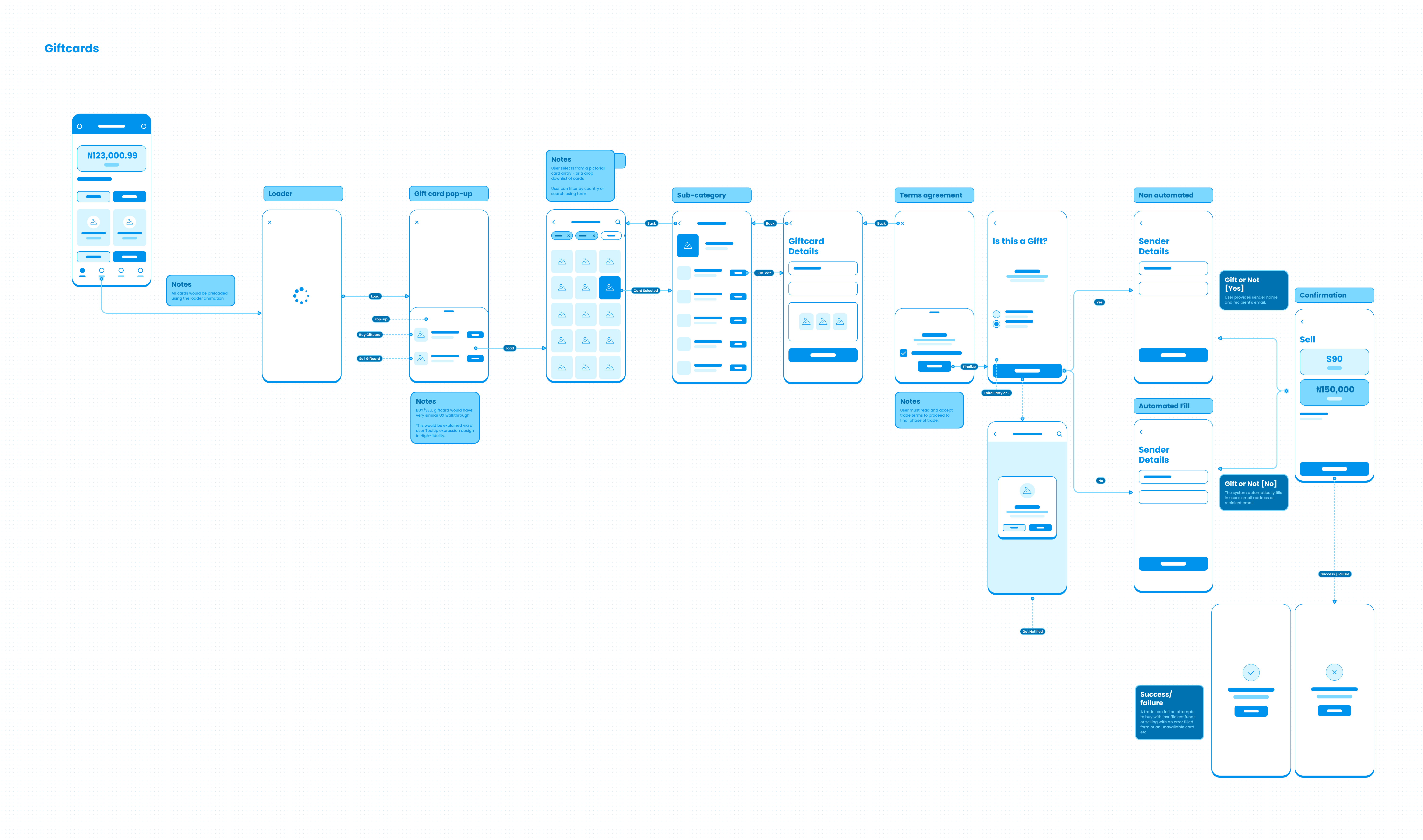
- A guided three-step flow: Select, Upload, Confirm
- Real-time upload feedback and a progress indicator
- Inline tips and support access at the moments users get stuck
E-commerce: the new Shop
- A Shop tab for browsing digital gift cards and services
- Cart, checkout and in-app delivery of purchases
- Pay with wallet balance or integrated fintech channels
Wallet and transactions
- Simpler wallet top-up
- Detailed transaction history with clear statuses
- Exportable statements
Onboarding and help
- Contextual onboarding the first time each tab opens
- FAQs and chatbot access throughout the experience


Process and decisions
1. Research and audit
The heuristic evaluation and interviews set the priorities. Users told me: “I never know what step I’m on when selling a card”, “Sometimes I’m not sure what a button does” and “I’d love to shop digital gift cards easily too.”
2. UX writing
Clarity and tone were treated as trust signals:
- “Submit” became “Upload Gift Card”, so the action is explicit.
- “Pending” became “Under Review”, with a tooltip explaining what happens next.
- Success screens use human language, for example “All done! Your card is on its way.”
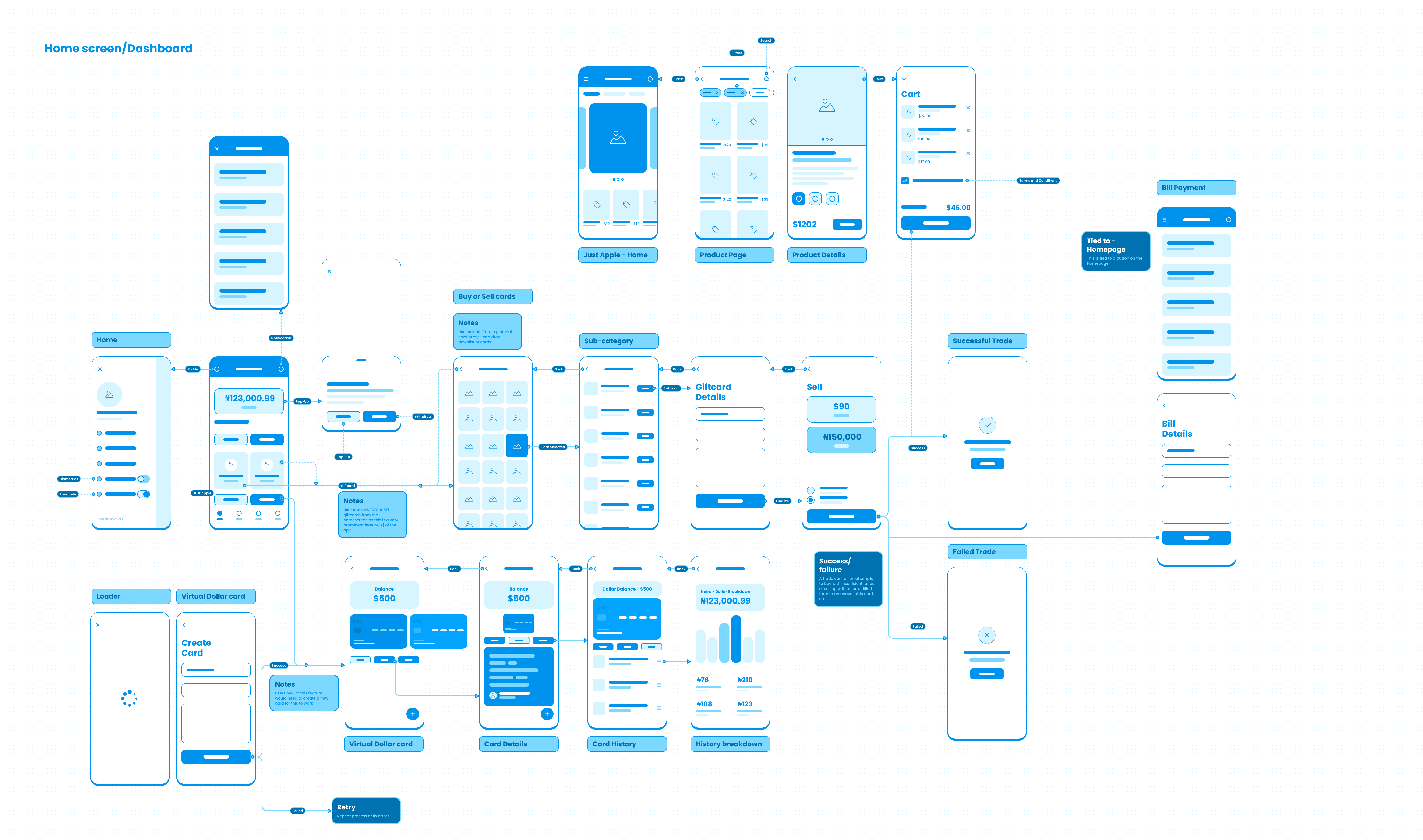
3. Wireframes and low-fidelity prototypes
- Simplified the home screen around two primary actions: Sell Gift Card and Buy Gift Cards.
- Added bottom navigation for Wallet, Transactions and Shop.
- Structured the selling flow into three steps: Select, Upload, Confirm.
4. High-fidelity UI
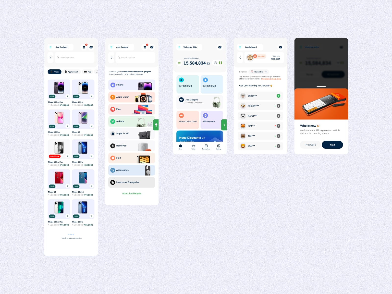
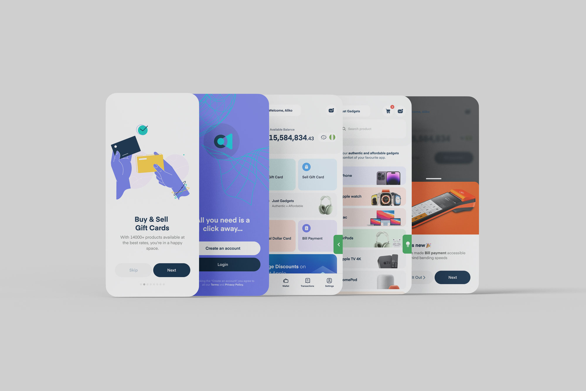
- A clean, modern interface with trust cues such as security badges and FAQs embedded in the flow.
- A personalised dashboard with balance, recent activity and quick actions.
- A Shop with filters, cart and digital delivery.
Key decisions and trade-offs
- Steps over one long form. Splitting selling into three steps adds a tap or two, but gives users a sense of progress and makes errors easier to fix.
- Plain statuses with context. Fewer, clearer statuses with tooltips, instead of exposing internal states.
- Shop as its own tab. A dedicated tab makes buying discoverable without crowding the selling journey on Home.
What I learned
- In fintech, feedback and wording do as much for trust as visual polish.
- Small copy changes can remove whole categories of support questions.
- A new business line, like the Shop, works best when it stays out of the way of the core task.
Next steps
Usability-test the new sell flow with existing users, then track completion rate, time to trade and support volume against the old app.